
VISUAL IDENTITY / BRANDING
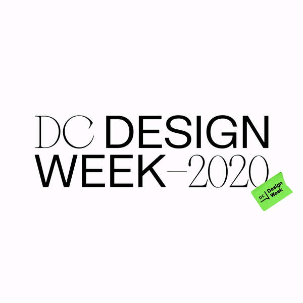
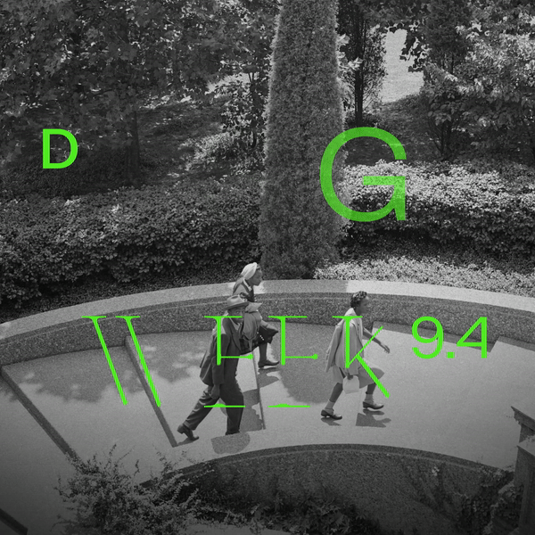
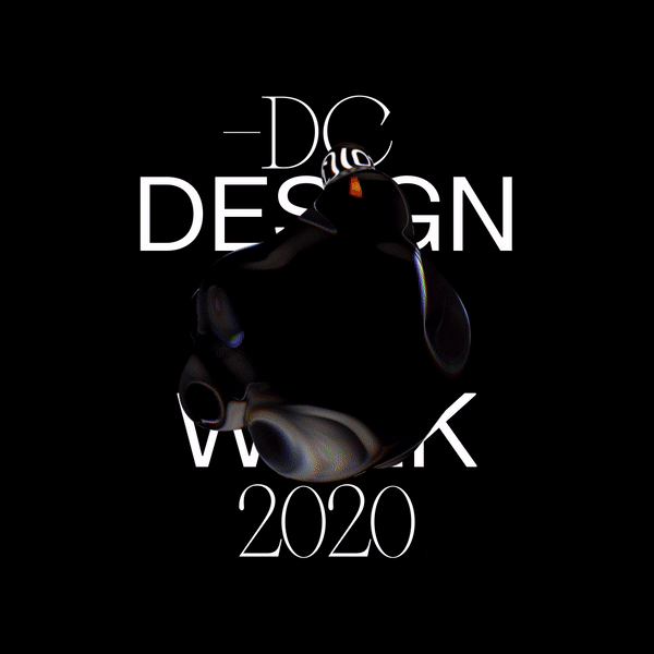
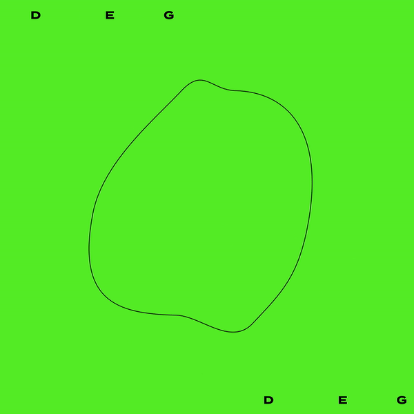
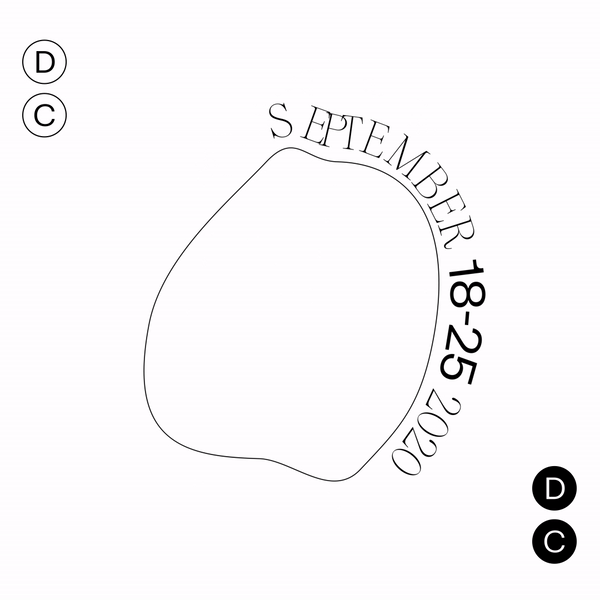
DC Design Week
DC is known for stodgy politicians and cement buildings. We set out to break away from this boring, tired perception and expose the thriving (yet niche) creative community in the DMV.
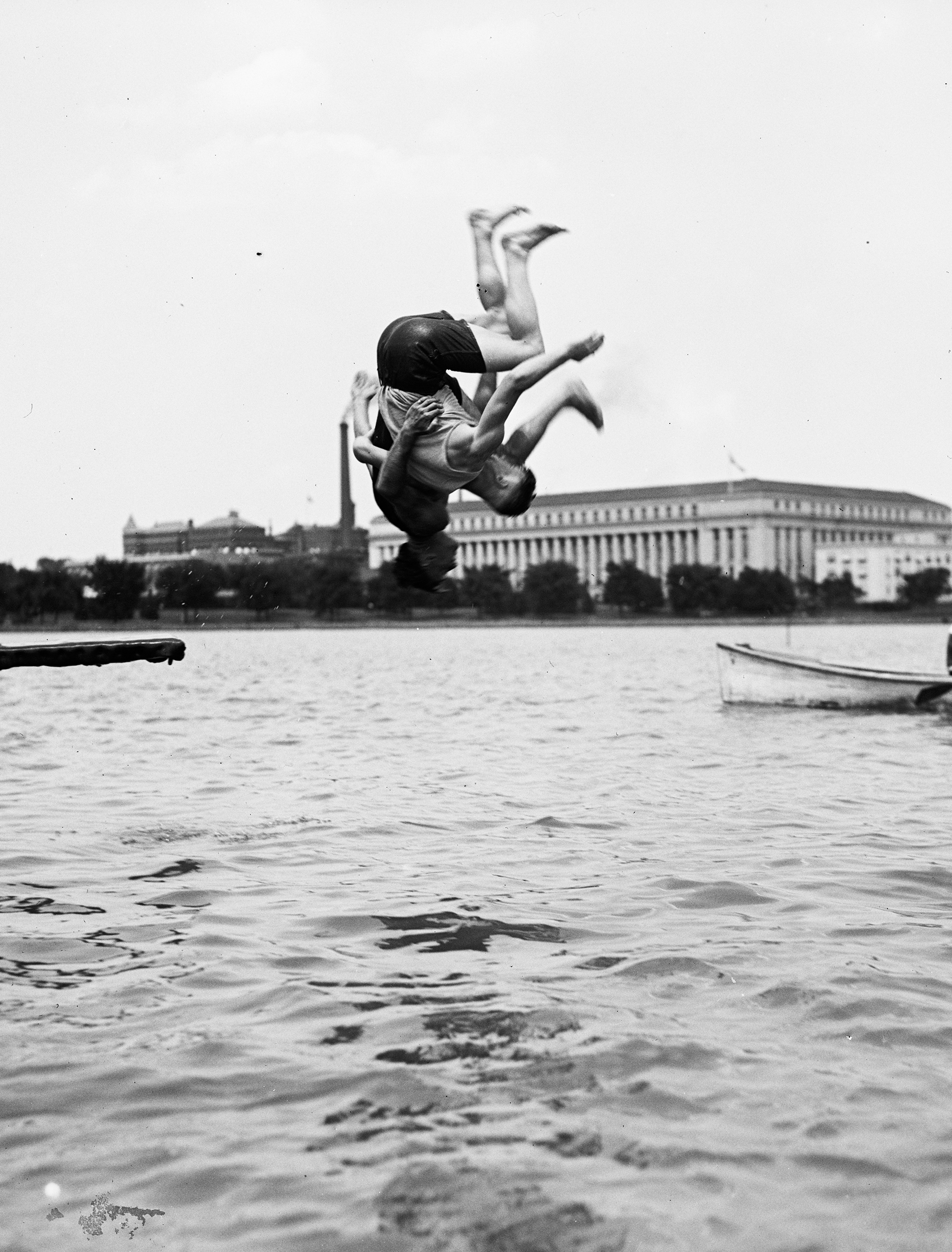
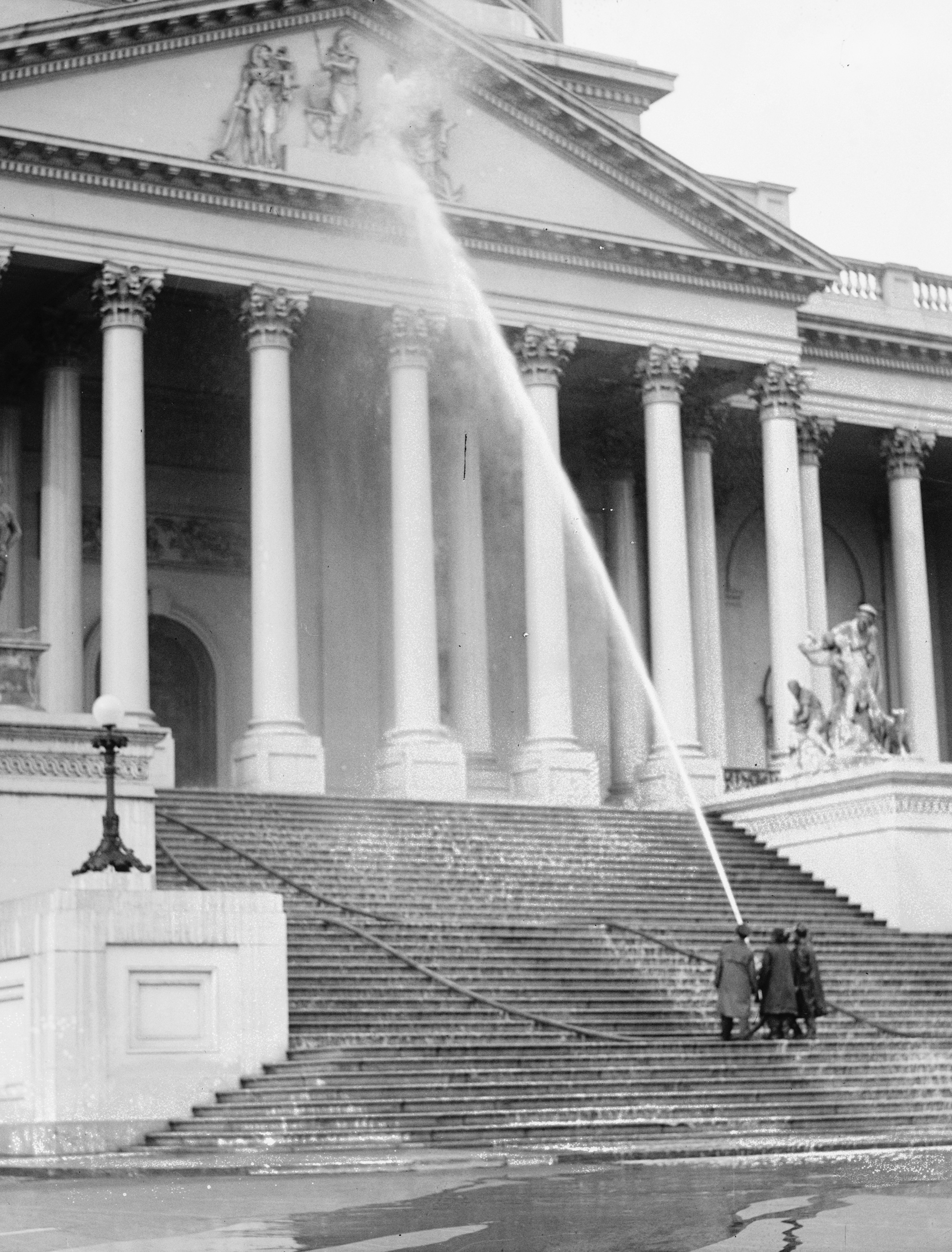
In this unexpected visual identity for DC Design Week, we combined bold typography and color with morphing 3D textures and archival photography from the Library of Congress.
Featured on Behance - Graphic Design
In this unexpected visual identity for DC Design Week, we combined bold typography and color with morphing 3D textures and archival photography from the Library of Congress.
Featured on Behance - Graphic Design


Creative Agency - This January
Creative Director - Maggie Gaudaen
Art Director & Brand Designer - Monica Tan
Video Editor - Nathan Colby
3D Assistance - Duke & Duck
Account Director - Erica Goodwin
